Home • News • GitHub • Wiki • Samples • InForm • GX • QBjs • Community • More…
SAMPLE: LFX
Author
Description
''''''''''''''''''''''''''''''
'LFX by Jon Mark O'Connor '
' '
''''''''''''''''''''''''''''''
'Copyright (C) 1995 DOS World
'Published in Issue #20, March 1995
*****************************************************************************
LFX.BAS
by Jon Mark O'Connor
Copyright (C) 1995 DOS World
Published in Issue #20, March 1995, page 59
LFX.BAS is a lettering-effects generator that lets you vary the size of
letters, from small to gigantic; produce shadowing; and parlay QBasic's 16
colors into hundreds of different hues. The program's simplicity of design
makes it easy to create thousands of lettering effects by changing just a few
program values. If you like to dabble in QBasic, you can put LFX.BAS to work
in your own QBasic programs in a matter of minutes.
Because LFX.BAS was designed with modification in mind, you can produce
professional-looking screens quickly, by typing in the text you want to
display, indicating where to place that text on screen, choosing type size
and foreground and background colors, and deciding how much shadowing to add.
To run the program from the DOS command line, change to the directory
containing LFX.BAS, then type:
QBASIC /RUN LFX
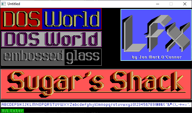
When you run the program, the word DOS will appear in a red box in the top-
left corner of the screen. To the right of the red box is a blue box
containing the word World. The text appears in gold and has shadow, depth,
and a hint of shine in the corners of the letters. Where does the gold come
from? It's not one of the colors for screen 9. (See the accompanying table,
"Color Attributes," below.) Actually, you're seeing an effect achieved by
layering.
look at the section of LFX.BAS labeled EFFECT1 to discover how this hue is
produced. The first two lines of this section use line commands to draw
background boxes; they follow the standard syntax for filled boxes:
LINE (X1, X2)-(Y1, Y2), C, BF
where X1 is the distance (in pixels) of the box from the left edge of the
screen, X2 is the distance from the top of the screen, Y1 is the distance
from the right edge of the screen, Y2 is the distance from the bottom of the
screen, C is a color value from zero to 15, and BF indicates that the box is
filled. (If you use B instead of BF, you create the outline of a box.) In
EFFECT1, the first line command creates a long red rectangle, and the second
one superimposes a smaller, blue rectangle on the red one, leaving a red
border two pixels wide on three sides.
The next six lines of the program assign variables:
WORD$ is the word or string you want to embellish.
SPACING$ is the amount of space you want to place between words. Used in
small sizes, the letterset designed for LFX.BAS is spaced properly, but when
you use large letters, you must decrease the space between the letters.
Ln tells the program to move left by n spaces; Rn tells the program to move
right by n spaces. To maintain the original spacing, use L0 and R0.
SIZE$ is the size of the letters. The value you specify must be a multiple of
4; you may increase the value to roughly half the size of your screen's
horizontal resolution. (In screen 9, the display is 640 pixels wide and 350
pixels high.) Multiples other than 4 skew the letters. Because the subroutine
LAYER1 employs extensive shadowing, using a size value smaller than 12 will
probably produce unattractive results. For smaller letter sizes, use the
program's NORMAL0 and NORMAL1 subroutines.
DOT$ handles special circumstances that arise with the letters i and j. When
you combine a small size value and shadowing, the dots over these letters
disappear. Because the text displayed in EFFECT1 doesn't include either of
these letters, DOT$ is set to N (for no dot). Later on, if you want to use
EFFECT1 to display some text that includes an i or a j, change N to Y.
BGC is the color of the background on which WORD$ is placed. Without this
line, the listing's PSET commands produce unwanted colored blobs at the
beginning of words.
At this point, the program has the information it needs to change DOS World
into a long drawing sequence.
When the CALL TRANSLATE line executes, control jumps to the TRANSLATION
subroutine, and conversion takes place. When control returns to the main
program, the next line of EFFECT1 establishes the colors used to create the
gold lettering and shadowing: yellow, white (gray), black, and light black
(dark gray).
Blending colors produces interesting hues. For example, if you place a light-
red line next to a light-magenta line, you'll see pink on screen. If you
change C1$ to "C15", WORD$ is displayed in silver instead of gold. As you
experiment, you'll find that some colors blend well and others don't.
Just for Effect
---------------
The message DOS World is in a DRAW command, you've chosen the colors, and now
it's time to display the message on screen--at varying locations and in
varying colors, to give the illusion of depth.
EFFECT1 works its magic by including four calls to the drawing subroutine
LAYER1. Each time through, LAYER1 executes 12 PSET commands, each of which
begins drawing at a different screen location.
Keep in mind that the coordinates for the pixel in the upper-left corner are
(0,0). So, when the starting positions for PFT and PFL are
52 and 13, respectively, they're 53 pixels from the top and 14 pixels from
the left.
The first four commands in LAYER1 use C3$, black, to produce four renditions
of the text in black. These renditions overlap, producing a shadowing effect.
The use of gray in the fifth line adds more depth to the shadow.
This same multilayer approach enhances the appearance of the gold lettering:
three renditions of the text--two in yellow and one in white--overlap to give
the words both height and depth.
But maybe you don't care for gold, or you'd like a little less shadow. No
problem. Just set different background colors, combine various foreground
colors, experiment with the values of PFL and PFT, use more or fewer calls to
LAYER1, or include more or fewer PSET commands.
Remember, though: If you add too many shadows, the letters of your text will
overlap, unless you increase the value of SPACING$.
Try adding REM statements before all but one of the call LAYER1 or PSET
lines, to get a sense of how that line affects the final appearance of the
text. Repeat the procedure with other lines.
Sometimes, making a slight change in PFT or PFL produces unexpectedly good
results, which you can then capitalize on.
Shadowing is also very important, as the rendition of Sugar's Shack (EFFECT4)
demonstrates. Often, words that look plain are greatly improved by the
addition of a series of shadows placed one or two pixels to the left or right
of the main word. Be sure, however, to place the commands that draw shadows
before the ones that draw the text so that the shadows remain in the
background.
If you're not sure whether a particular color is adding anything to the
overall effect, change the color to something else. It isn't always apparent,
for example, whether COLOR 8 is enhancing the appearance of a shadow. To find
out, change the color value to 14. If you see yellow lines, you know that the
original color is having an impact, and you may then change the color setting
back to 8.
Before you jump into creating full-screen displays, such as menus, consider
the speed of your computer. On a 25MHz 386 or a slower system, displaying a
full screen of special effects might take a few seconds. If neither you nor
your clients or friends mind a delay of that length, then by all means go
ahead with the project. If you don't want the user to see the effect being
drawn, add the command SCREEN 9, 9, 0, 1 at the beginning of the display
process and SCREEN 9, 9, 1, 0 at the end. This flashes the display on the
screen.
If you're not partial to either of those display methods, try using a SCREEN
12 command to produce your effects at a higher resolution.
Choices, choices, choices--LFX.BAS gives you a lot of them. But isn't that
one of the great things about programming? You control the final effects.
COLOR ATTRIBUTES
VALUE COLOR VALUE COLOR
----- ----- ----- -----
0 black 8 light black (dark gray)
1 blue 9 light blue
2 green 10 light green
3 cyan 11 light cyan
4 red 12 light red (orange)
5 magenta 13 light magenta
6 brown 14 yellow
7 white (gray) 15 high-intensity white
QBjs
Please note that QBjs is still in early development and support for these examples is extremely experimental (meaning will most likely not work). With that out of the way, give it a try!